

COPA AMERICA BRANDING BY BRANDIA CENTRAL
The Copa América (American Cup) is the South American equivalent of the European Championship. Every four years, teams in the South American Football Confederation (CONMEBOL), plus two invited teams, one of which is usually Mexico, compete in a different South American host country to be crowned champion of South America. It is the oldest international football tournament in the world.
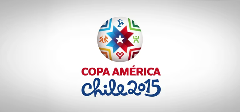
The most recent Copa América was held in Chile in 2015. Brandia Central, the well-known Portuguese branding design agency designed the branding for the tournament in Chile. They also did the branding for the 2016 Euro Championship and the upcoming 2018 World Cup in Russia.
Their particular challenge was to create a design that captured the diverse nature of South America, Chile itself and the flair of the players. As with their other projects they spent a lot of time deeply researching the main elements of Chilean culture and the feelings of the local people.
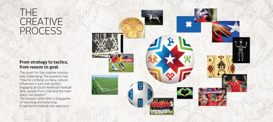
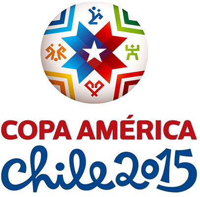
The above graphic describes Brandia Central’s creative process and the key elements of their design strategy. The center point of the logo is the five-point star found in the Chilean national flag, inside an eight-point star. The eight-point star carries special meaning as it is not only a national symbol, but the eight points represent the eight Chilean host cities. There is the kultrun, an ancient tribal drum, textiles and images from indigenous culture that represent celebration, passion, overcoming, and triumph. The four figures that surround the stars are the ‘bicycle kick’, considered a beautiful Chilean football move, an image of a fan cheering, a heart, and competing players, each reflecting the key elements of Chile and the region. The overall result is a visually modern logo, that conveys color, cheer, ambition and modernity. The color gradients give the logo flexibility.
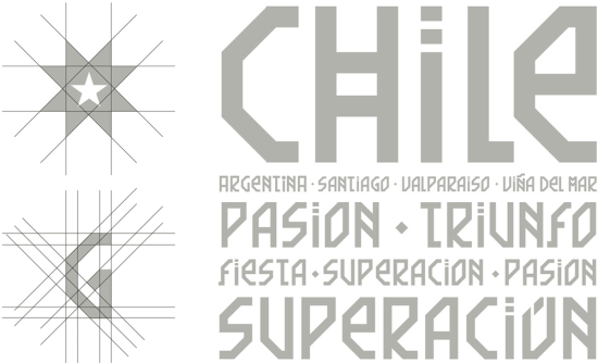
The typography was developed through thorough research once again. Brandia Central found that typography was part of the Chilean culture, with hand-written signs common among Chilean businesses. This was the inspiration for the tagline “El Corazón del Fútbol” (the heart of football). The ‘Chile 2015’ geometric typeface was based on ancient tribal patterns.