

MANCHESTER CITY F.C. BRANDING

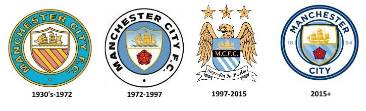
At the end of 2015, Manchester City launched a new badge, which was to appear on the team’s shirts from the start of the 2016-17 season, following much criticism from fans of the design of their previous badge. The new badge followed a fan consultation on whether to change the club badge and replace it with a new design. After the consultation, the club decided to replace the then badge with a new version to be designed along more traditional lines.
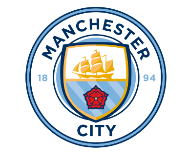
The new design was a departure from the previous badge, which had been in use since 1997, and was more reminiscent of the badge the club had used between 1972 and 1997, which incorporated a round design like that was used by two of their three previous crests. The design was consistent with other City Football Group owned teams; New York City FC, and Melbourne City FC.
Like the previous three emblems, the new one included a shield featuring a gold ship, which has appeared in the club emblem since its inception. The rivers Irwell, Medlock and Irk are represented by three diagonal stripes, with the red rose reflecting its Lancashire ancestry. But for the first time, the badge also displays “1894”, the year the club was founded.
Prior to 1970, players did not traditionally wear badges on their shirts, and Manchester City had previously worn just three other badges, prior to the most recent one. The first badge was introduced in 1970, and was based on logos which had been used since the 60s on official club documentation. It consisted of a circular badge which used the familiar shield with a ship and three stripes as a center point inside a circle, with the name of the club in it. In 1972, the stripes in the lower half of the shield were replaced by the red rose of Lancashire.
However, when Manchester City plays in a major cup final instead of using the normal badge, the players’ shirts sport a badge containing the arms of the City of Manchester to reflect the pride in representing the city at a major event. This custom is a throwback to the time when the players’ shirts did not normally feature a club badge. One exception was for the 2011 FA Cup Final, when they used the club badge with the Manchester coat of arms represented by a small monochrome logo in the numbers on the players’ shirts.
Manchester City’s traditional home colors are sky blue and white, while their away kit has featured maroon, red and black, as well as a variety of other colors, particularly more recently. The club has worn the blue, white and black colors since the late 1800s. In the club’s early days, it played in scarlet and black, and from documentation dating back to the 19th century, there is evidence that it played in black jerseys bearing a white cross, reflecting the club’s origins as a church side. On the other hand, the red and black sometimes worn as an away color is reportedly an influence of former assistant manager Malcolm Allison, and are a direct inspiration of the colors of A.C. Milan, a successful club at the time, which it was hoped would provide some form inspiration to the team. Regardless of whether the colors played a part, City won the 1969 FA Cup Final, and both the League Cup Final and European Cup Winners’ Cup Final in 1970 in the red and black colors rather than in their home sky blue colors.