

PREMIER LEAGUE BRANDING
The Premier League’s new branding identity was developed by the brand and design agency, DesignStudio, in collaboration with Robin Brand Consultants. It was implemented for the 2016/17 season, in order to better represent fans, community projects and the players.

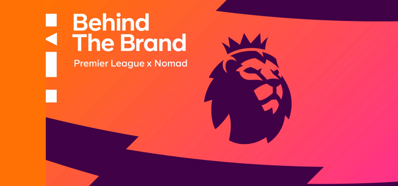
The new identity continues to feature the traditional lion icon, albeit a simplified version, a new rounded sans typeface, and a dynamic new color palette of zig-zag patterns and clashing bright.

DesignStudio used focus groups and eye-tracking software that revealed that people tended to be attracted to the image of the lion before looking at the wordmark. Therefore, the agency focused on the lion’s face as the center piece of the logo, making around 600 sketches before choosing the final version.
According to CEO and co-founder of DesignStudio Paul Stafford many people around the world understood that the lion represented the Premier League therefore they didn’t want to destroy everything that was there and start from scratch, but wanted to build on the Premier League’s existing equity and heritage.

The previous logo used capitals in the wordmark which felt too aggressive, while the new logo uses lower-case – a friendlier and discussive tone – and a font that was custom-made for the Premier League by Monotype. The “Premier League” words themselves have been aligned to be more balanced in length. The custom-made font can be used across the Premier League brand – one of the chief aims was to make it more usable across broadcast and digital formats.
One of the features of the branding was to be able to update the colors every few years. Currently, they use yellow, green, blue and red. This was in order to move away from the traditional red, white and blue, and change the image to more bold, vibrant and colorful, maintaining a contemporary image reflected of the current day.
The colors were also chosen to allow for flexibility in use and across audiences such as for formal applications, community projects and to address children. For example, brighter colors can be used for children while an aubergine wordmark on a white background gives a more serious feel for use in official documents and financial reports.

DesignStudio has chosen to use imagery that is personal “focusing on people and their expressions.” And using vibrant color washes over original photographs of players, in line with the work they had done for Spotify. To complement the new branding, the Premier League launched a film that showed footage of both community projects and Premier League matches in order to underline the inclusivity of football.

One noticeable difference in the new logo is that there is no direct visual cue that associates it with football. Someone without a prior knowledge of what the Premier League is may be none the wiser, but it does perhaps reflect that the Premier League is confident in its worldwide recognition of its brand by its target audience.
ertretdfg
Comments are closed.