

UEFA EURO 2016 BRANDING
The UEFA European Championship (also known as UEFA Euro), the 15th UEFA European Championship, is the football championship held every four years between men’s teams from competing European countries. The branding for the 2016 event, held in France, was carried out by Brandia Central, a Portuguese brand consulting agency. This was the same agency that did the branding for European championships in 2012, and will also be working on the branding for the FIFA World Cup to be held in Russia, 2018.

LOGO INSPIRATION
The theme to the logo for the UEFA EURO 2016 was “art”. This was based on the role of art in French life and culture, whether in terms of food, fashion, technology or architecture. France is synonymous with style, elegance and refinement. This inspired the design of the logo, which is based on the idea of “celebrating the art of football”.
Associating football with “art” underlines the beauty, unpredictability, the players’ passion and intensity for the game; characteristics that make football such a popular sport all around the world. Since numerous fans from overseas would be descending on France to not only witness the highest level of football but also the nation’s beauty and culture. So this link between art, France and football made a natural inspiration for the logo.
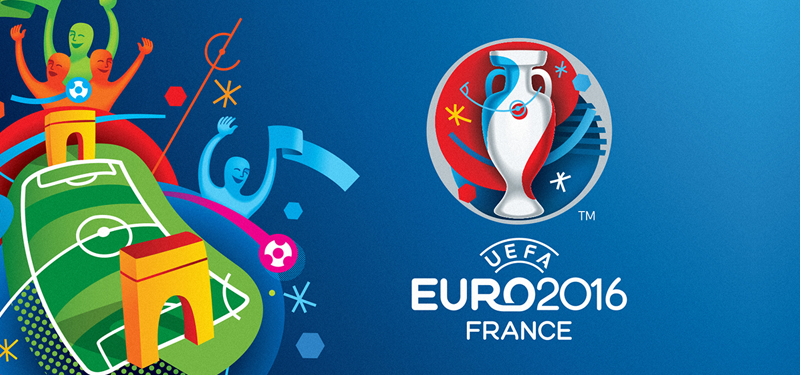
THE LOGO
The UEFA Euro 2016 logo combines the concepts of both art and football. The main focus of the logo is an outline of the European Championship trophy, which is named for Henry Delaunay, one of the chief architects of the creation of the European Championship. In fact, the first championship was held in 1960 in France, Delaunay’s home country. The outside is a typical circle shape, containing motifs such as pitch markings and references to the Avant-Garde, Art Deco, and Art Brut art styles. The hexagonal shapes represent both the patches on a football and also the shape of France on a map, as it is often described by French people as being hexagon-shaped. The logo’s color scheme is red, white and blue, similar to the French flag, resulting in a stylish and striking visual.

THE VISUAL IDENTITY
Following the logo’s use of art as inspiration, the European Championship’s brand visual identity also used art as an original concept for its representation of football. Incorporating famous French landmarks, such as the Arc de Triomphe, the graphic pattern features a football field with celebrating fans surrounding it. The graphic itself incorporates a number of artistic styles and concepts including collage, creating a harmonious composition that conveys a feeling of festivity.
STRONG TRADITIONAL ART
Brandia Central built on these concepts to create the identity for the 2016 European Championships. France’s long tradition in the arts was combined with football and festivity. It captures several art movements, for example, avant-garde, art deco, fauvism and abstractionism. Using art as a concept for branding was interesting as it also highlighted the artistry of football itself.
Using the Henri Delaunay cup as the centerpiece provides a more overt link to football, and along with the red, white and blue tricolor united the concepts of art, football and France in a festive way.

Brandia Central also developed the World Cup 2018 logo to be held in Russia. They researched Russian culture and heritage to find some key moments in the country’s rich history. Like the European Championship 2016 logo, the Russian version also used the trophy as a central element and used graphic elements to represent Russian art and the Sputnik satellite – the world’s first. The design was even launched in space aboard the international space station.