

THE VISUAL EVOLUTION OF FIFA WORLD CUP LOGOS
The first FIFA world cup was first held in 1930 and since then each competition has adopted its distinct visual identity. In this document, I am going to research the visual evolution of World Cup logos.
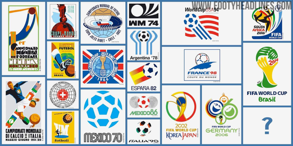
Early Years (1930 – 1950) – Poster Designs
The first tournament in Uruguay 1930, shows a highly stylized goalie making a save. The poster was inspired by avant-garde abstract and surreal movements of the era.
Mid 20th Century (1954 – 1966) – Local Rules
Until mid-20th Century, the tournament hosting countries had complete control over the visual identity and FIFA didn’t adopt any concept of official visual identity for these tournaments.
The World Cup logo began to evolve into the single emblem that we know it as today during this period, but retained a bit of local flavor. Switzerland’s 1954 logo is centered around the distinctive white Swiss cross and England’s 1966 logo uses the Union Jack as the background.
Late 20th Century (1970 – 1998) – Simple Patriotism
The World Cup logo did not change much during this time period, but almost all of the logos shared three key traits – the host country’s name, the host’s national colors and a ball. Argentina’s from 1978 adopts the simple blue and white of its flag; Spain’s from 1982 includes a modernized and sporty Spanish flag.
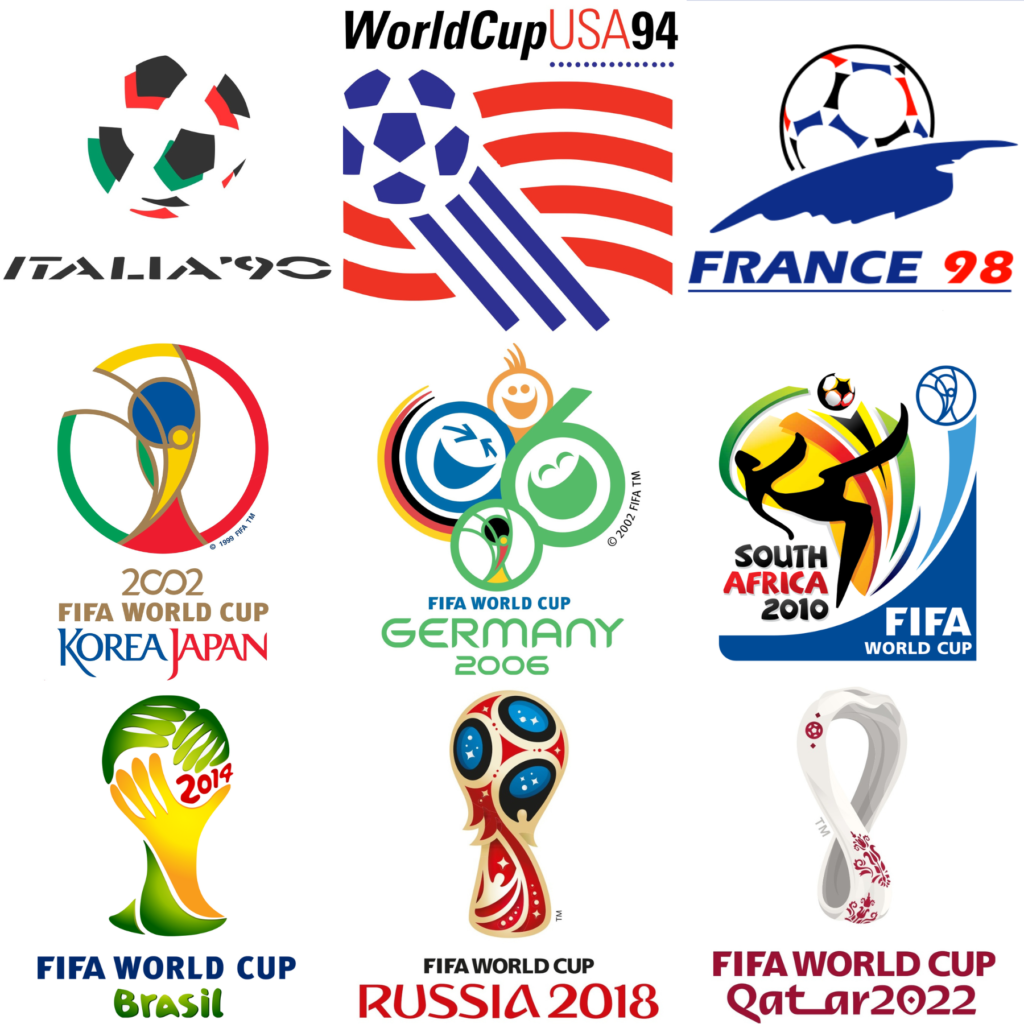
21st century – (2002 – Present) – High Concept Symbolism
Starting with the Korea/Japan tournament 2002, the World Cup logo began to stand for more than just a unified visual identity. Contemporary logos borrow from the host country’s culture and history to tell a story beyond just what happens on the pitch.
2002 Korea/Japan
The 2002 logo “builds on the artistic principles and traditions of Korea and Japan, such as asymmetry, dynamism and harmony, in order to live up to the high quality of design for which both countries are renowned,” said Andy Milligan,
Germany 2006
The 2006 logo, designed by the UK-based agency Whitestone, aimed to celebrate the German people’s joy, happiness, and smiles.
South Africa 2010
The logo’s color scheme leans heavily on South Africa but forms an outline of the entire continent in a message of unity across the continent.
Brazil 2014
Brazil’s twin dimensions – modernity and diversity
The winner, created by Africa Agency, was inspired from the “iconic photograph of three victorious hands together raising the world’s most famous trophy,” according to a FIFA press release. “As well as depicting the uplifting humanitarian notion of hands interlinking, the portrayal of the hands is symbolic of the yellow and green hands of Brazil warmly welcoming the world to Brazilian shores.”