MAJOR LEAGUE SOCCER BRANDING

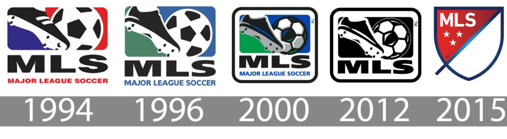
Major League Soccer (MLS), is the highest level professional football (soccer) league in the USA and Canada. It was founded in 1993 as a key component of the United States’ successful bid to host the 1994 FIFA World Cup. In 2015 it launched a major rebranding effort, “MLS Next”, to mark its 20th season and highlight its growth to a greater number of teams, stars and stadiums.
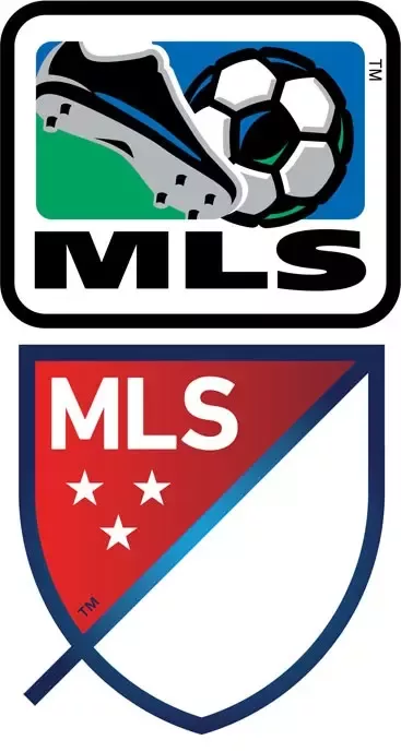
As part of this rebranding effort it developed a new logo. The original logo had undergone only a few minor changes since the league started, while the new logo represented a dynamic shift in how it wanted to be perceived locally and globally. It became less “cartoonish”, with the shape changed to a shield from a square, and with the removal of the obvious football-related visual elements.
The designers replaced the football and boots on the previous logo with a blue line around the shield that represented the field touchlines, and a diagonal slash to represent the speed and energy of football. The slash divides the crest into two halves – a first and a second. Meanwhile, the three stars you can see represent the club, country, and community – three key aspects to the MLS mission. In regards to the colors used on the shield: red, white, and blue are intended to convey feelings of national pride in the two home countries. One clever aspect of the new logo is that it offers an opportunity for MLS clubs to customize the colors to suit their own branding, not to replace their own logos, but for the two logos to sit alongside one another as you can see in the graphic below.
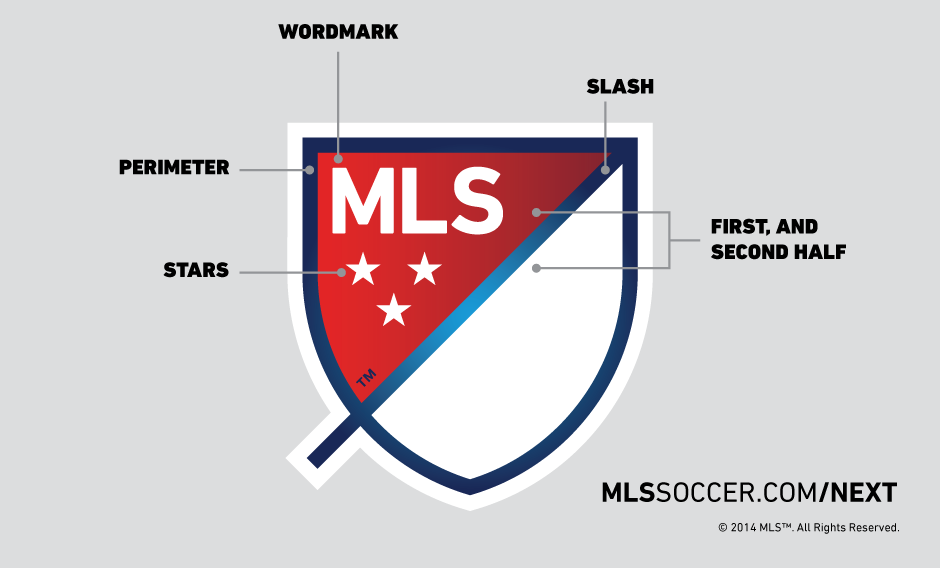
WORDMARK: MLS stands for Major League Soccer.
SLASH: The slash refers to soccer’s speed and energy. The slash begins outside the perimeter and drives upward at a 45-degree angle to illustrate both the nonstop nature of our game and the rising trajectory of our league. It bisects the crest to create a “first half” and “second half.”
STARS: The three stars represent the pillars of our brand: For Club, For Country, For Community.
PERIMETER: The perimeter represents the lines that mark off the field of play.
FIRST HALF AND SECOND HALF: The first half contains MLS and the three stars. The second half is an open white space that brings you in and out of the MLS world.